I was a UI/UX designer on a major reorganization and digitization of FEMA's grant management systems. Below are some highlights of my contribution to the project.
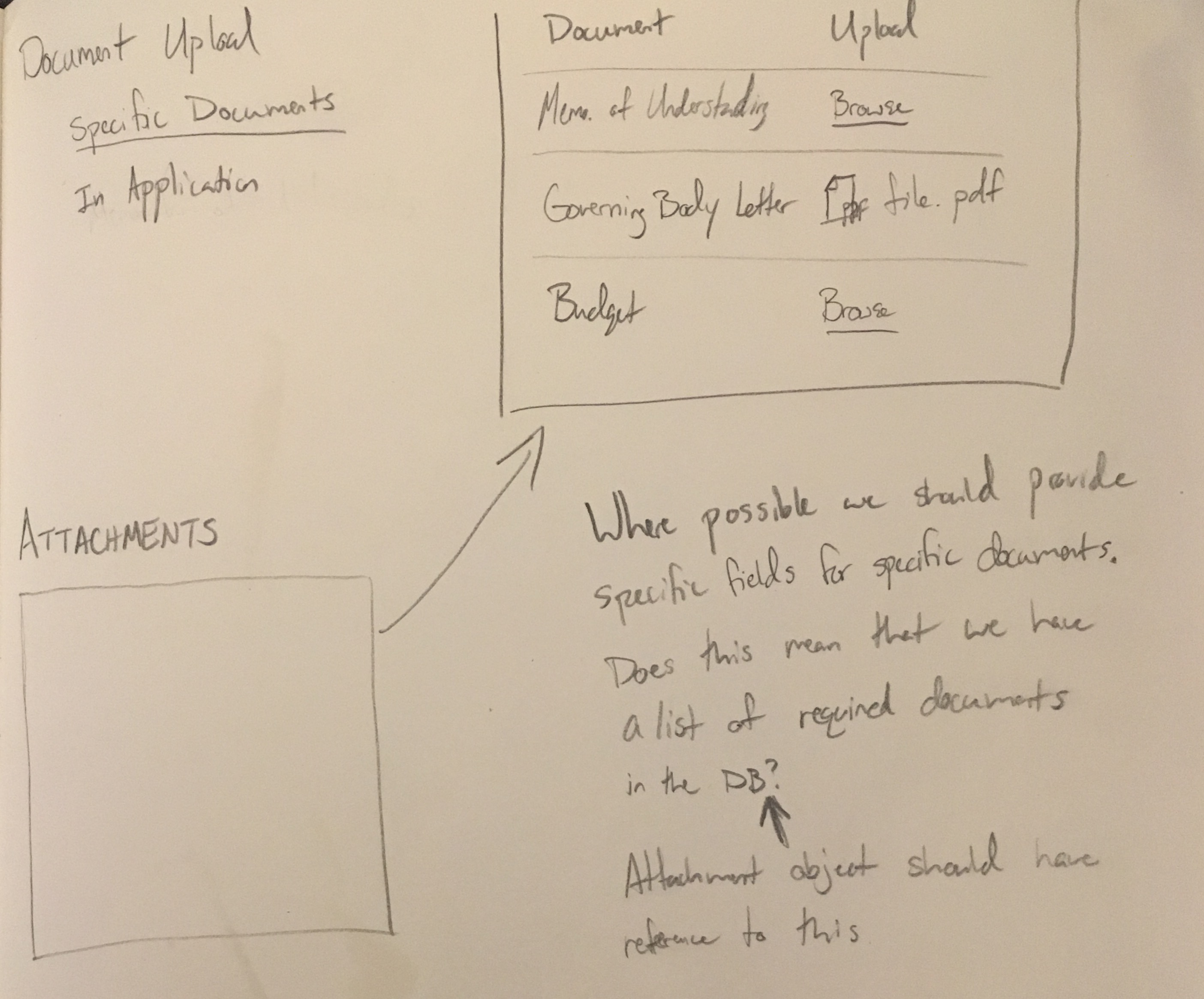
I designed the initial framework for managing attachments in FEMA GO. In collaboration with product managers and designers on my team, I interviewed FEMA staff and grant recipients across grant programs to understand the needs and current practices of potential users of the system. We found that users employed a variety of naming conventions, folder schemas, and spreadsheets to keep track of everything.
With our research in hand, I organized a cross-discipline ideation workshop. We sketched and discussed familiar upload patterns from other applications, different methods of collecting upload metadata, and where the attachments were used.
After a few iterations, I proposed a solution that attempts to enrich attachments with contextual metadata on upload. This relieves the user from the burden of providing context manually and improves the reliability of data available to users that rely on the attachments in later tasks.

FEMA staff are often required to review high volumes of grant applications with quick turnarounds. This need creates logistical issues for management trying to track and facilitate reviews. To help address this pain point, I looked at the tracking needs of a particular review process. Management needed to be able to see the rate of progress, potential bottlenecks in the pipeline, and how the program was performing against specific goals.
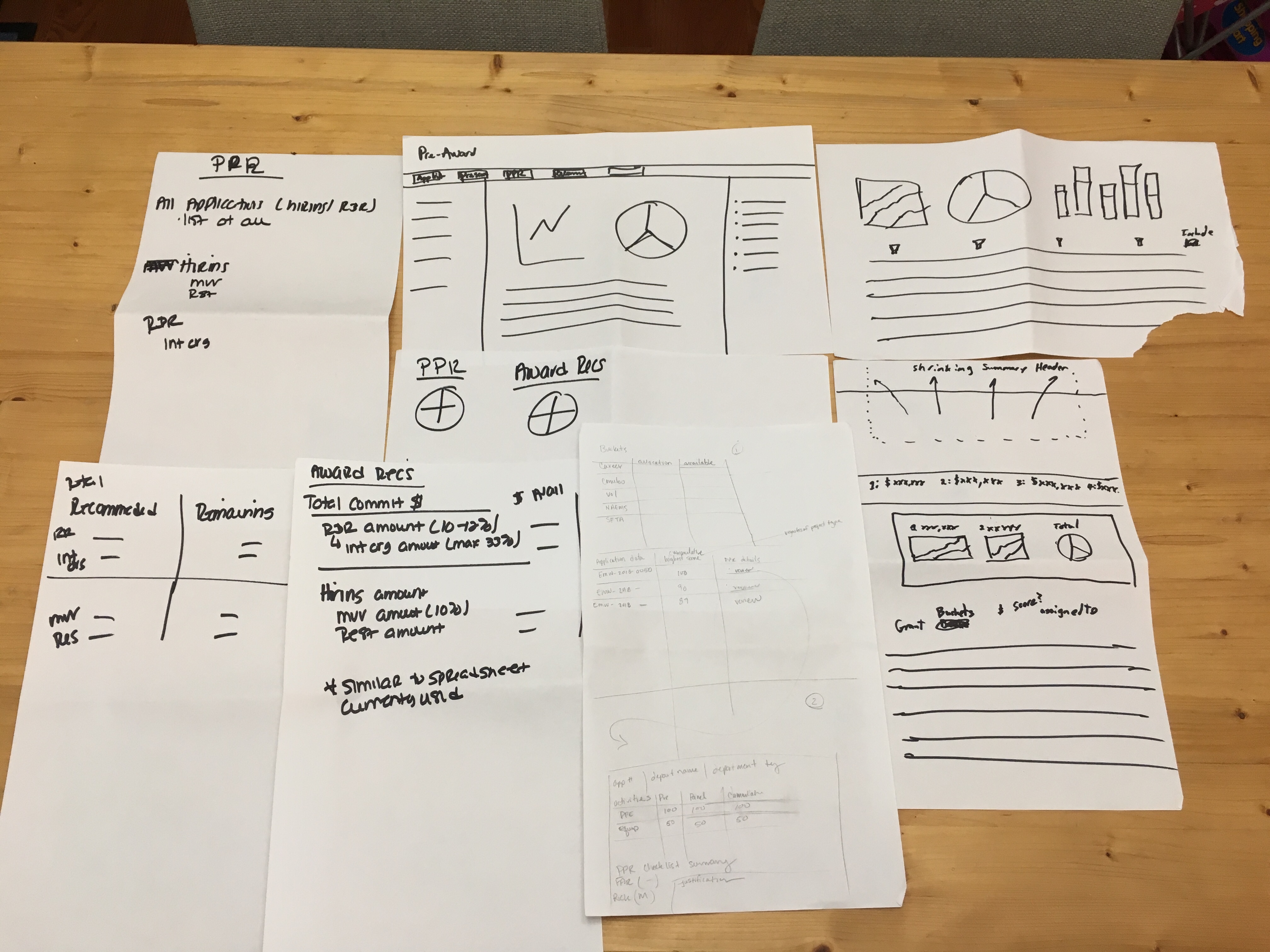
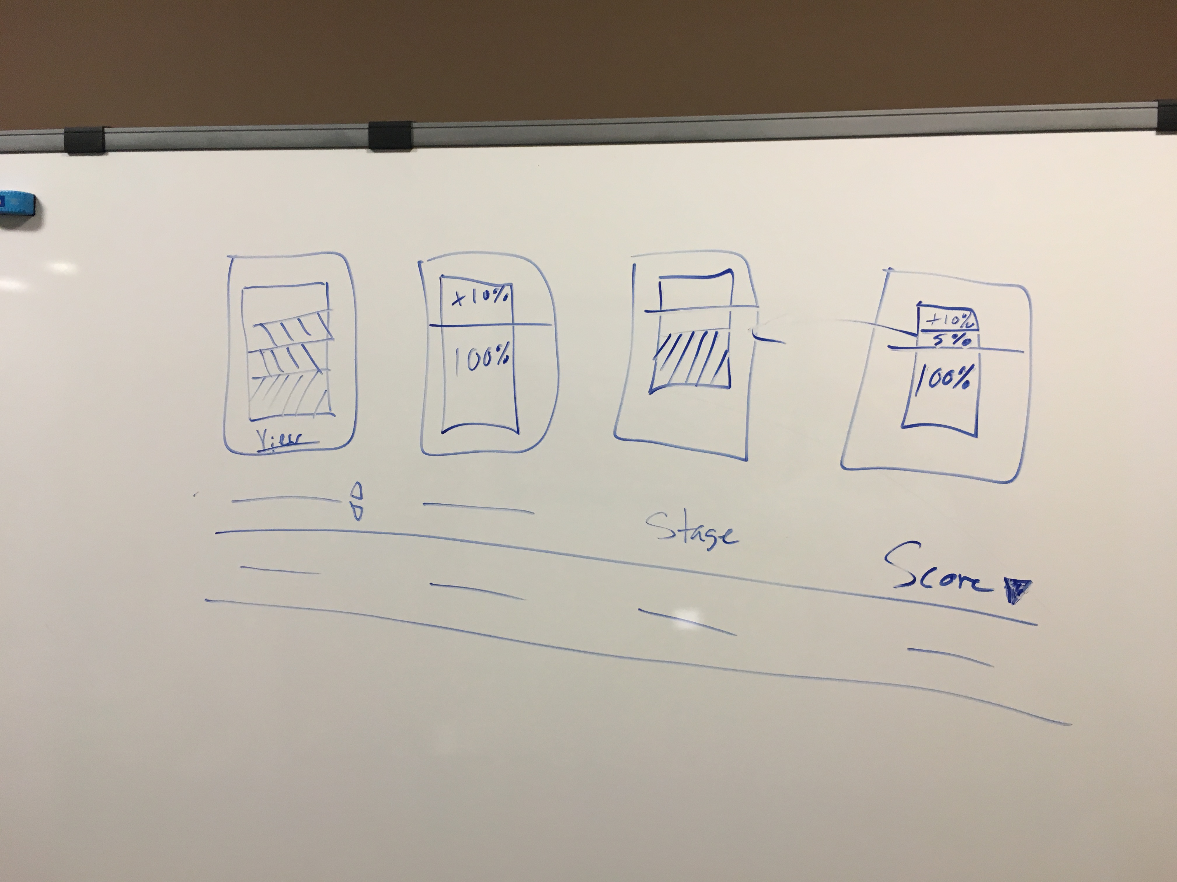
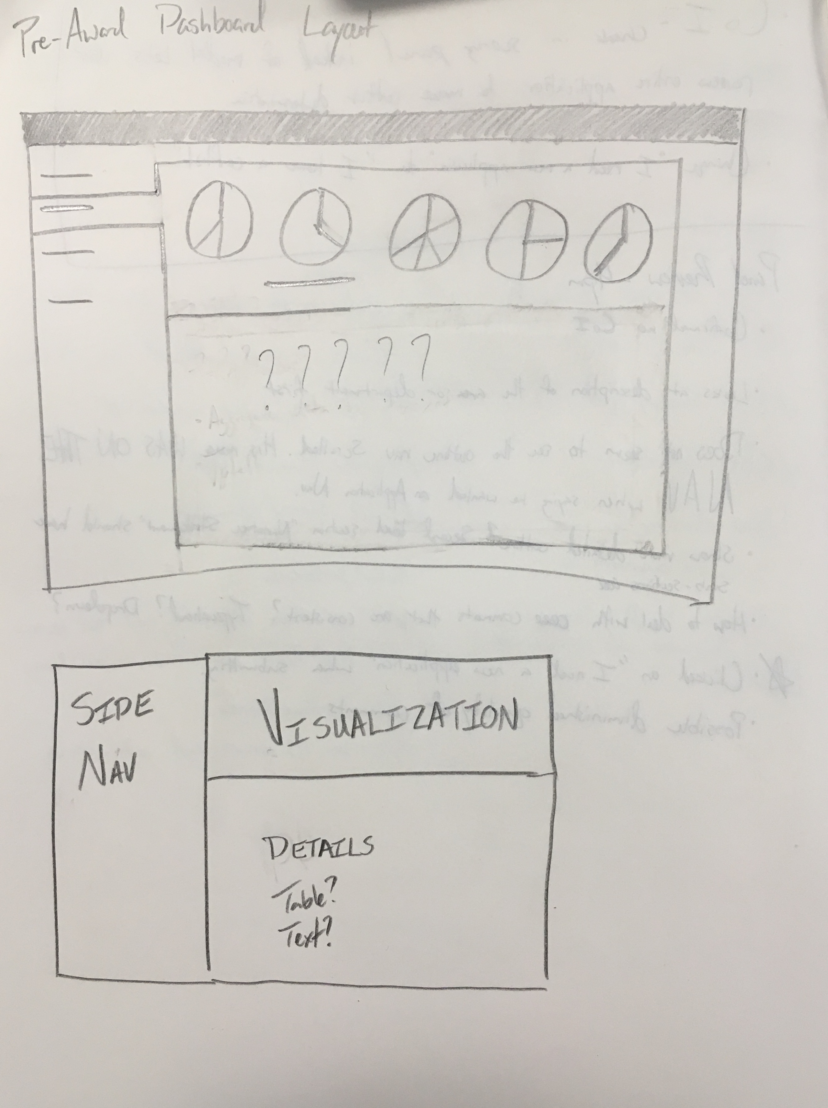
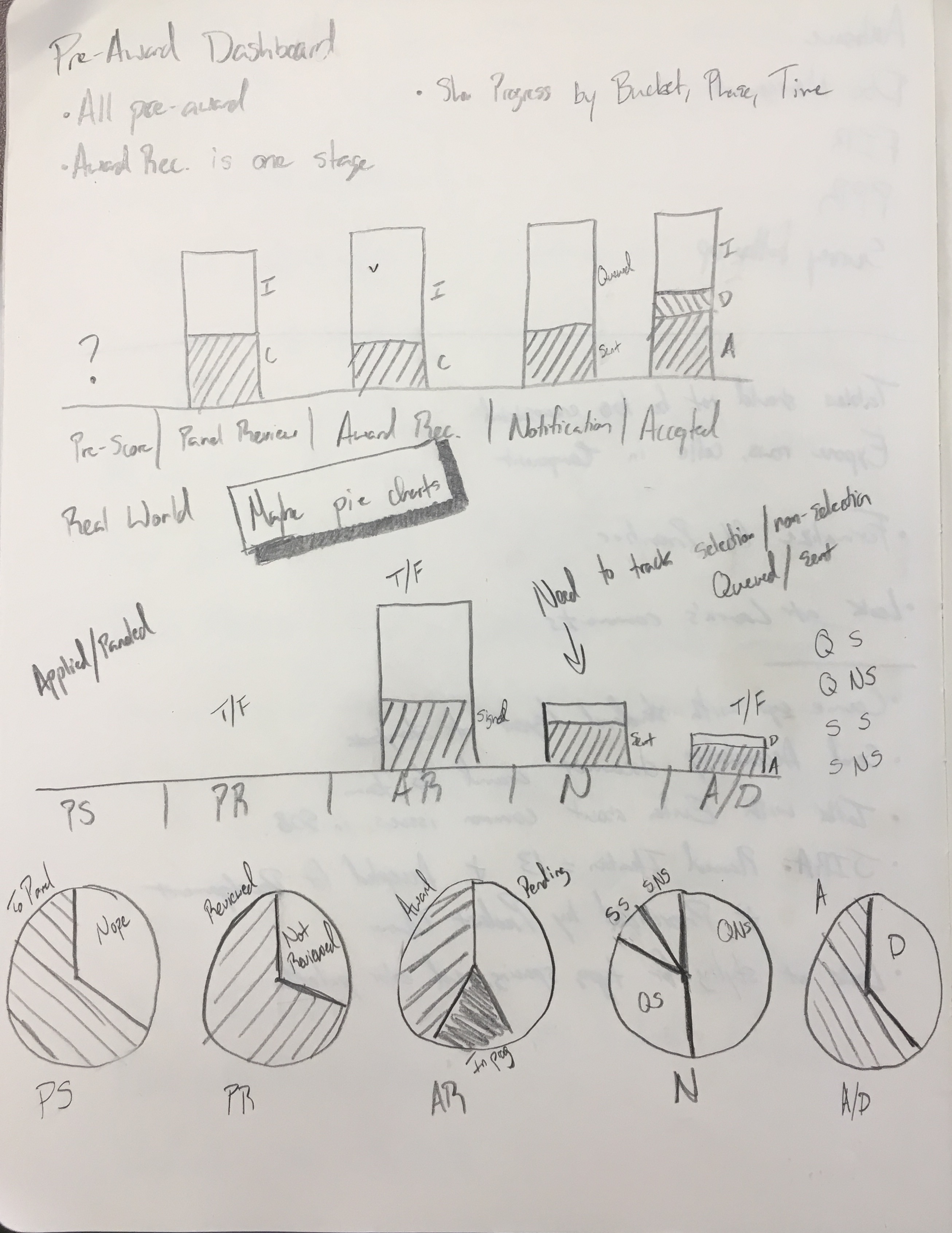
After engaging users, stakeholders, and our own developers, I created a simple layout that gave users a high-level overview of performance vs goals, allowed them to dive down to the individual steps in the pipeline, and left room for growth as new reports were needed.
